Mapping Covid-19 numbers in Bangladesh
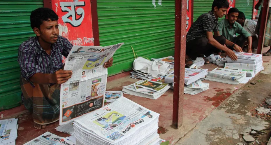
Bangladesh is a vast country made up of 64 different districts. Therefore, providing clear information about the Covid-19 pandemic is a challenge. To give the people reliable information, access to correct data is indispensable. Dataful, Free Press Unlimited’s new partner in Bangladesh, has developed a visual that gives a comprehensive picture of Covid-19 related deaths per district.
Polash Datta, himself a former journalist, is the founder of Dataful, the first data journalism initiative in Bangladesh. Dataful aims to make open data accessible to the people of Bangladesh. “After taking a course in data journalism in 2014, I began to understand the potential of open data, and how that data could be used for journalism purposes. However, at that time Bangladesh wasn’t ready for it. In 2018, I was able to establish Dataful, to bring data to the journalism field,” says Polash.
Correct data for reliable information
With the outbreak of Covid-19, data has become even more important. The public relies on data to stay informed, and the government uses it to determine its policy. But the data currently available on deaths with Covid-19 symptoms is fragmented and doesn’t paint a complete picture. Polash: “In March of this year the first case of Covid-19 was identified in Bangladesh. Since then reports on deaths of people with Covid-19 symptoms have been published by multiple media outlets, creating a very scattered picture. The government has regularly communicated the number of deaths, but only the confirmed cases, not those that died with Covid-19 symptoms. There was no comprehensive overview that took all the numbers into account.”
This triggered Dataful to make sense of the scattered information, and create one complete picture that also examines the situation per district, which was missing from the information provided by the government. “It was impossible to determine the districts where most people had died with Covid-19 symptoms, or their age, or their gender,” says Polash.

You can find all the data here.
Creating a complete picture
Dataful collected data from 2,500 reports from eight different media websites. With the available data, Dataful then created visuals on deaths with Covid-19 symptoms in Bangladesh, including data on confirmed cases from the Directorate General of Health Services (DGHS). The visuals can be found here, on a website created with support from Free Press Unlimited.
One of the main findings shown in the visual is that the districts with the highest number of deaths don’t match the districts with the highest infection rate. This might be due to differences in testing capacities, which could cause policy makers to underestimate the situation in areas where death rates are high but little testing is done. That could influence the way the government is handling the pandemic. However, according to Polash, it is highly unlikely that the government will use their data visual. “But if they were to use our visual, they would recognise the need to take more preventive steps in districts with more Covid-19 related deaths as opposed to just confirmed cases. Right know they are overlooking this,” he says.
Polash continues: “The highest number of deaths were in the Cumilla district. However, this is not one of the districts with the highest number of confirmed cases. These findings are important for the second phase of the pandemic, that will play out in the coming months.”
Supporting quality journalism
With their visual, Dataful was able to create more insight into the Covid-19 numbers. As a result, the media have easy access to more accurate data, which helps them to bring the public reliable information about the pandemic. Since the release of the visual, several media have used it in their coverage of the pandemic.
The visual covers the data from March to August 2020. Dataful will continue to track the current numbers and update the visual accordingly with new data.
Photo in header: Paul Enkelaar